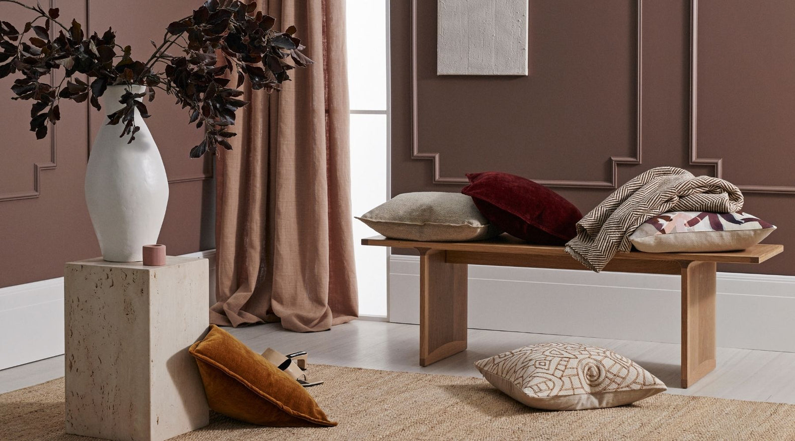
Behind the Scenes - An Insight into the Developement of our 2021 Collection


Our designer Meg Sinclair takes us behind the scenes to show us the inspiration behind and development of our Autumn/Winter 2021 collection.
Over the course of a 12 month period the research, development, and creative process bring together a final collection of cushions, throws, and floor rugs. Here we break down the various stages of the creative process to give some insight into how our collections are created.

Trend Research
At the beginning of the process, I start considering what is influencing a wider social & cultural situation rather than look for more detailed micro trends that may be influencing fashion or fast-moving product areas. It’s more about the bigger picture and what it influences our lives as a whole. For example with Covid in our lives currently - we are spending far more time in our homes and it has become increasingly important to enjoy our home environment. We want to have an inviting, warm and liveable home, filled with items we love and have meaning. So it’s the wider macro trends that tend to influence the aesthetic trends of each season.

Setting the themes and colours for the collection
These themes are influenced by the earlier macro trend research completed. Each theme has its own personality and aesthetic drawn from the earlier research. Influence can be taken from film, architecture, crafts, art, and fashion. At this point, I start pulling together mood boards of elements and images that inspire me that link with the theme I have developed. From here a colour palette and mood start to emerge for each theme group and the personality and style for each theme become apparent.

IMAGE: The beginnings of one of the themes for our AW21 release, Momento, that takes its direction from nostalgic print and pattern and vintage textures such as boucle and washed velvet.
The new colours in Nevis were consciously kept to classic shades. Who doesn’t love Camel and it is perpetually on the radar as a trend colour. Dusty Juniper green and maroon Rhubarb are definitely key colours for the season.
Creating original artwork for prints & embroideries
Once a colour palette and aesthetic are confirmed for each theme I start working on artwork signature prints and embroideries. This is the fun bit where the creativity really starts and you get to pull out the paint and brushes. Once final artwork is completed the final stage is often digitally capturing the artwork so we can manipulate the print into repeat or create alternative colourways.
Monstera was actually a pattern that I had developed for an earlier season but I had coloured in tones of green. It didn’t make the summer range but I loved the pattern and recoloured it for the Hinterland collection. By recolouring this design in unexpected tones of Spice and Charcoal - I think it created a more interesting and graphic feature pattern for the Hinterland group.

From furniture through to soft furnishings. Boucle adds a textural element that you can layer with other plains and patterns in your interior. This adds interest and depth.
Colouring plains to coordinate with the patterns
The final stage in range development is determining which colours to add to our plain cushion collections. It is important to have a selection of plains to coordinate back with our signature prints and embroideries. Each season I review our existing colour lines and determine which colours of the season are required to develop and refresh the colour line. Colours for lab dips are then sent to our suppliers and returned to us on the actual quality and we make a decision on which colours to include.

IMAGE: Selecting colours to add to our Nova cushion range. Each season our core plain items are given a seasonal refresh.
Styling the range and the Photoshoot
This is my favourite part of the season. For me - the range really comes to life when you see the product on set or in location. It’s like the icing on the cake when you see the final shots for the season. We have furniture custom made for the shoots and build and paint sets to work with each season's release. It’s a huge job and takes a large team to pull it all together. We work with Bek Sheppard as our stylist and she does an incredible job bringing the ranges to life each season.
In this digital age, having beautiful imagery is key. We use the images across print, digital and social media to promote the release. We aim to capture at least 200 images each shoot from hero shots to smaller vignettes of the product.

Hinterland reflects a relaxed and informal way of living. Rattan is a classic weave that has been prevalent throughout so many design styles. I loved the idea of taking this classic weave pattern and transforming it by using embroidery to create the pattern.


