Choosing a winning cushion colour combination

Wanting to incorporate more colour into your home? Cushions are a fun, quick and easy way to transform any room.
“Colour is easily added to any space with the addition of paintings or artwork, rugs and of course the easiest way is with a selection of beautiful cushions. These can be changed up with the seasons to create a warmer environment for winter and a fresher look for summer.” - Jill Flint | The Living Room
Whether you are looking to make a bold statement or experiment with contrasting patterns, we've got the top cushion styling tips to share with you thanks to interior designers Jill Flint & Carrie Deverson.

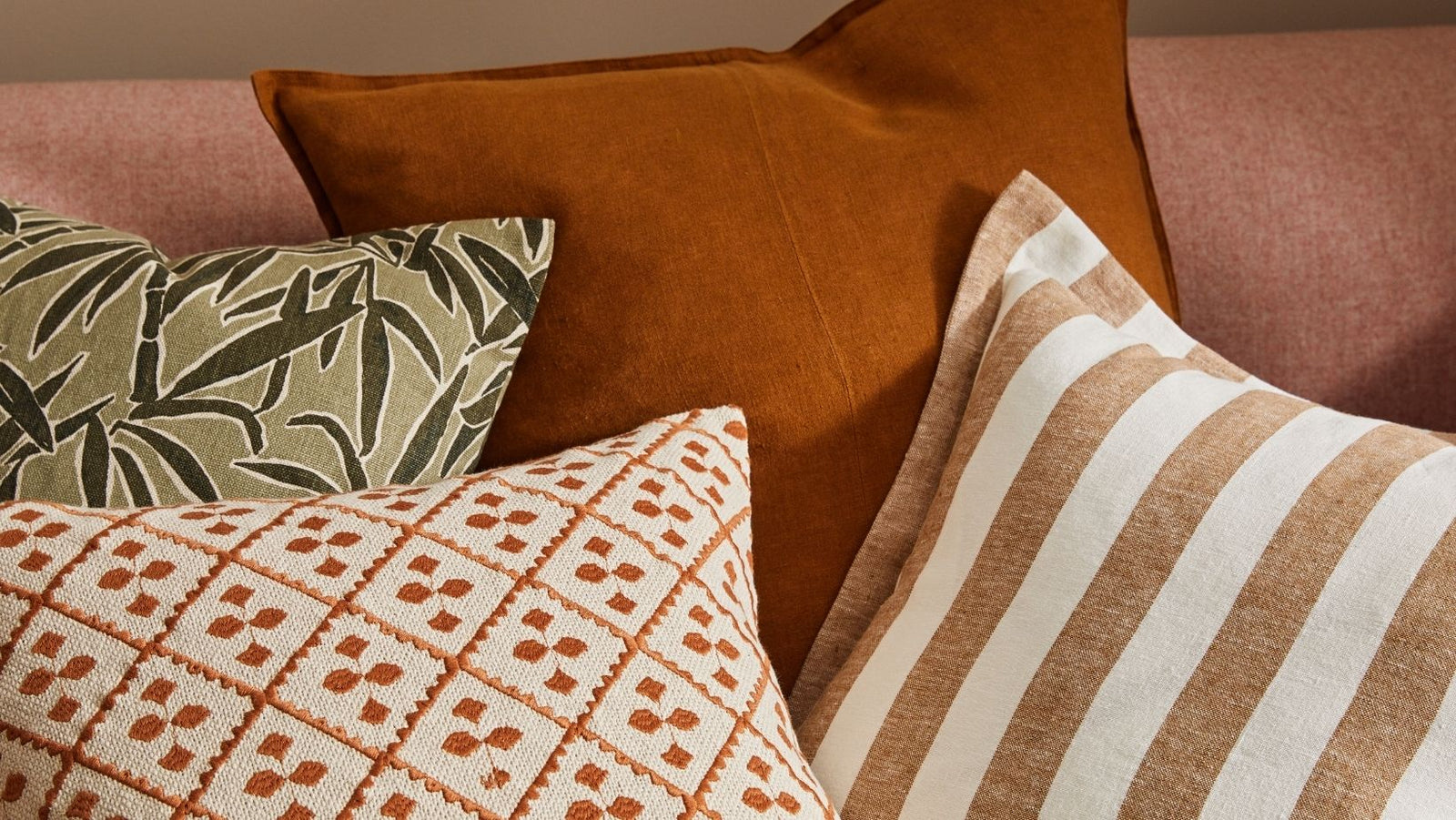
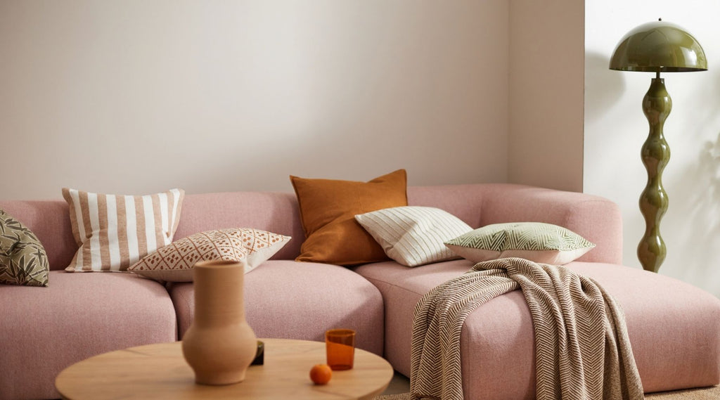
Featured: Guadeloupe in Olive, Vito in Spice, Byblos in Spice, and Como in Spice.
Consider your room’s colour palette
A good place to start is to look around your room at what colours you are already using. Are there two or three colours that stand out to you? Or are there more subtle colours in your furnishings and décor that you would like to draw out more? Use this is a basis for deciding on your colour scheme.
“When mixing colours and patterns I like to find a balance, to pull colours from other decorative features such as rugs and artwork, using one or two bold base colours with a few accent colours thrown into the mix.” - Carrie Deverson, Carrie Deverson Interiors
The most important element of your room to consider is your couch or bed linen’s colour.
Here are some popular combinations that you might like to use:
- Black: keep it simple with geometric black and white prints.
- Neutral: draw on Scandinavian design principles by combining subtle prints and soft tones.
- Beige: lends itself to bright patterns.
- Grey: anything goes! This is the perfect backdrop to make a statement.
- Brown/leather: the perfect canvas to create modern contemporary look with contrasting colours
- Navy: use a sophisticated and rich colour palette to make it pop.
Scroll through our Instagram feed @weavehomeau for some more colour inspo.
How to create a striking colour balance
Mixing and matching patterned cushions is not only acceptable - it is supremely on trend. Though the thought of choosing a combination of strong prints for your couch or bedroom may seem intimidating, there are some simple rules that you can follow to create a unified look.
Pro tip 1 - Different prints in the same tones look more put-together than not

Featured: Vito in Linen, Guadeloupe in Clay, Marino in Linen and Byblos in Onyx.
Pro tip 2 - Play with proportion
Pair bolder, more graphic prints together for a combination that's as unlikely as it is stylish.

Featured: Tropez in Olive, Vito in Clay, Byblos in Spice and Marino in Linen.
Pro tip 3 - Combine similar designs with opposing styles
This one is for the thrill-seekers! Mixing prints that are similar in design yet are from completely different style camps can create an eye-catching look.

Featured: Vito and Como cushions.
Choose colours for longevity
If you are looking for longevity from your soft furnishings there a few colour trends that never fade but ultimately, to ensure that you love your cushion combos forever, it should come down to your personal preference:
“It is important to use colours that clients have an affinity with. Colour is very personal and if the client loves the colour scheme, they will be happy to live with it for a long time. Following trends in colour is great for initial impact, but it can be short lived.” - Carrie Deverson, Carrie Deverson Interiors
Important design principles to consider
In the world of interior design, there are oodles of different rules for finding the “perfect” colour combination. From the Rule of Three to the 60-30-10 trick, thousands of new colour theories are being created every day.
As always, rules are meant to be broken! Regardless of whichever colour-selection method you choose to use, the most important thing to consider is the texture of the cushions so that you can create a harmonious look:
“It is important to add different textures such as linen, wool, velvet & silk. Weave’s beautiful cushions like Byblos and Weave’s Nevis throw all add texture and this will stop the scheme from looking bland. Also when using a bolder colour in a monochromatic scheme add deeper hues of the same colour for a beautiful rich effect.” - Jill Flint | The Living Room


